Adventure is out there!

Adventure is out there!

I designed this cute little poster after a quick google search. I designed it with Canva and then printed it in black and white.

IMG_6644

After printing the image, I taped it to the back of the canvas and traced the lettering and put in some quick details for the house.

IMG_1954

I painted the background with a quick basecoat and then started lettering with POSCA paint pens. This part required three coats, and it was a little tricky, even over a lamp. After the lettering dried, I went in with a detail brush and covered the whole painting in a second coat of paint to make it look flat. Then I started putting in details on the house, half with paint pen and half with custom mixed colors. The final step was to cover the white space with balloons, and honestly I might add more. While the balloons paint was still slightly wet I used a gray and white color to add strings, this way some of the balloon color got pulled into the design and the final look was more blended.

IMG_6110

Tips and Tricks:

  1. Designing the poster in Canva ahead of time saved me lots of frustration with alignment. It was easy and free!
  2. Paint pens were a lifesaver here. They were the most precise with the least amount of effort and left me with little mess.
  3. The house was important to do with mixed colors, despite the allure of paint pens. If it was done with paint pen it looked too blocky and childish. The bottom was also important. Even with just a few sparse details, adding the hint of plumbing and framing made the whole canvas look so much better.

How to Design a Good Canvas

1. Scour Pinterest. 

I’m not saying this because I think you’re going to find gold there. I’m saying that for every sorority girl’s poor attempt at a good design, or bad design with a good concept: you can get an idea for your perfect canvas. I have an entire board filled with dead end links, Etsy advertisements, and poorly executed arrows and angel wings. It’s how I got most of my ideas!

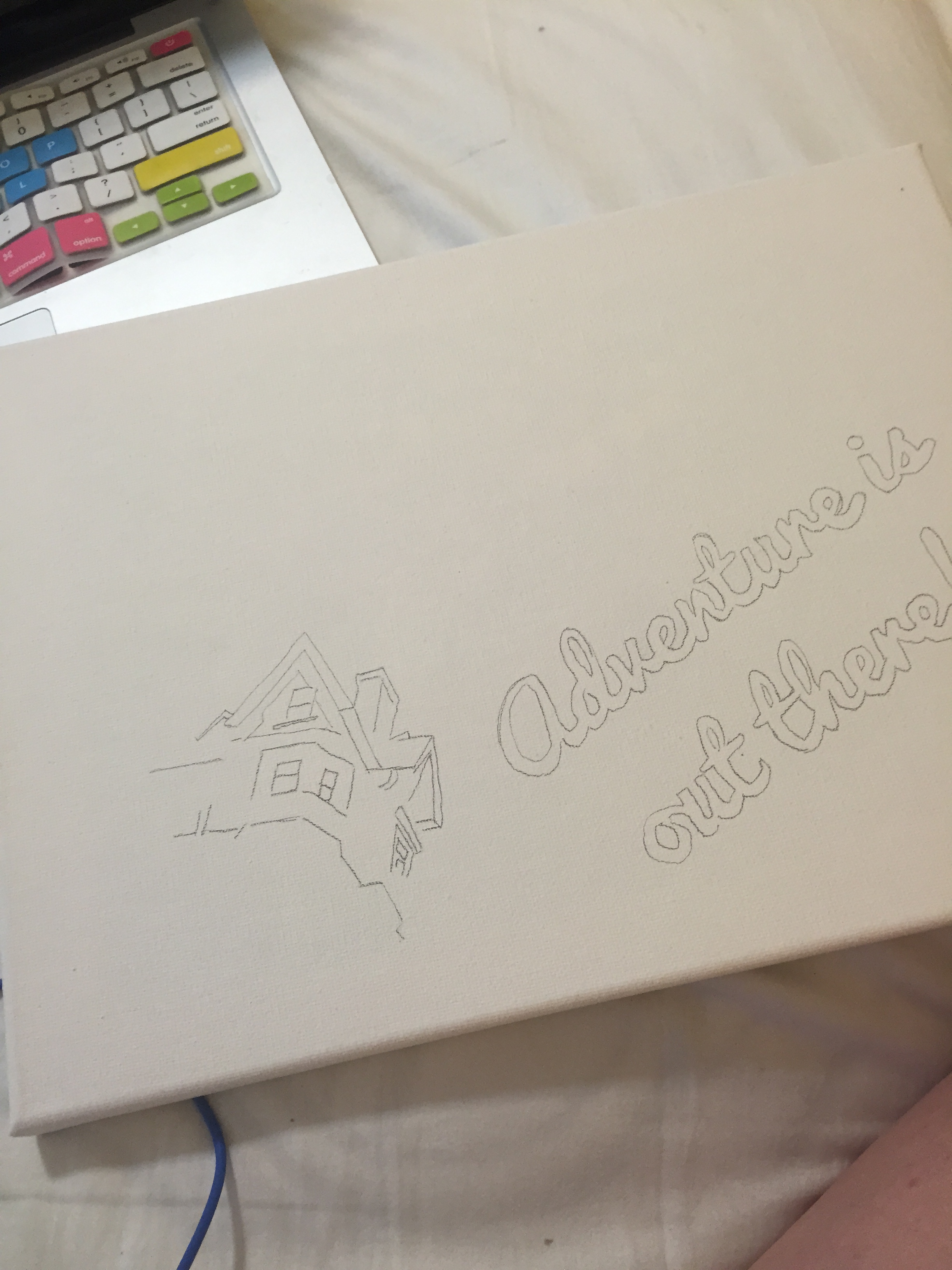
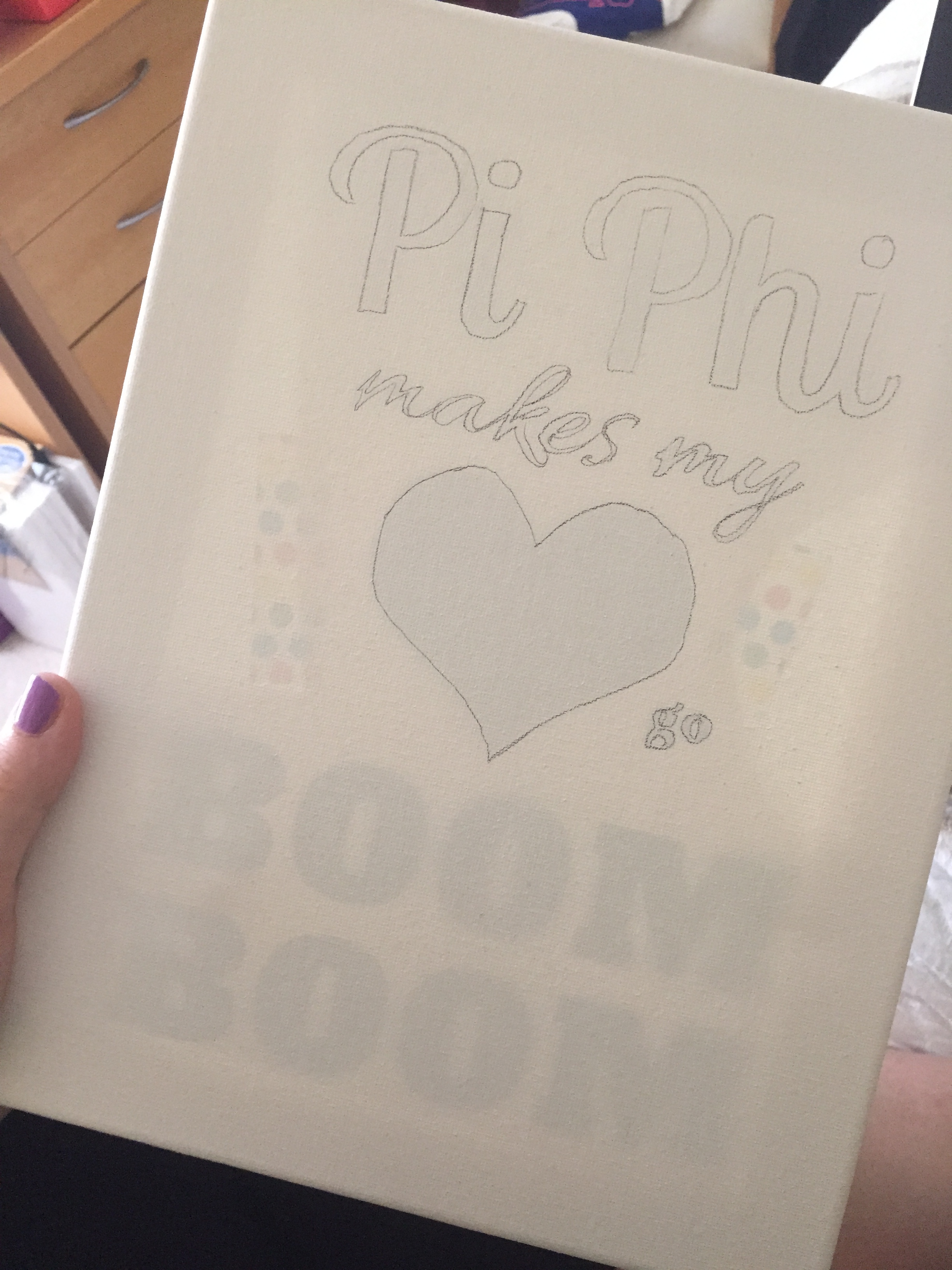
2. Build your Prints on the Computer

Powerpoint, Word, whatever. Just get your fonts to the right size on the computer and print them out. Tracing them onto your canvas will make your job infinitely easier.

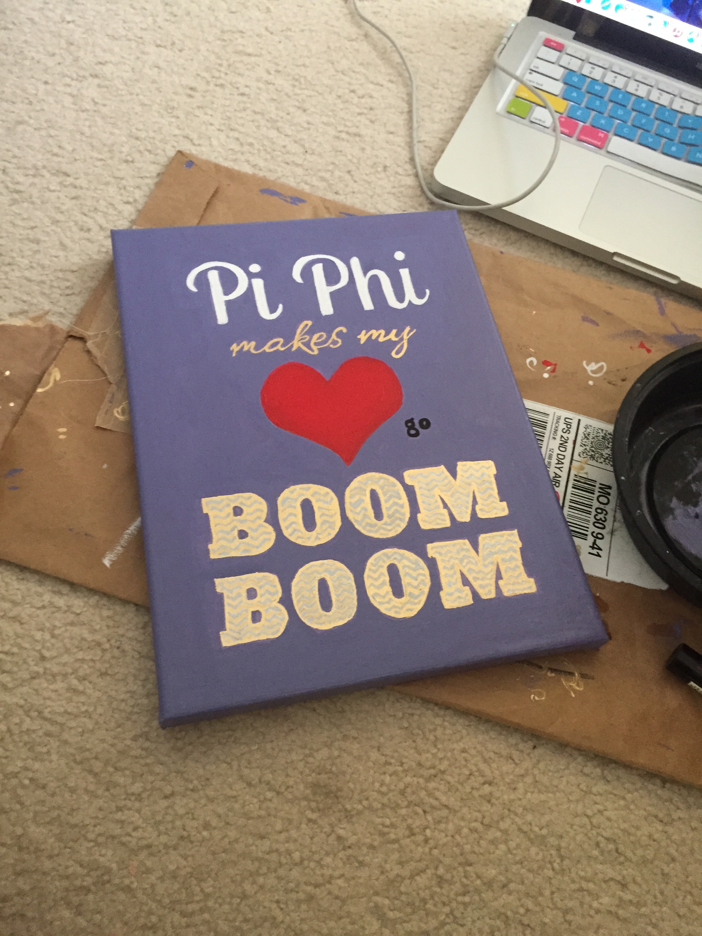
3. Think Color Scheme

I get it, Wine and Silver Blue. We love those colors, however tacky we thought they were in the first place. KD? Want to tell me more about your green shell Lilly print? By all means! But remember that this doesn’t have to translate into every craft or canvas you make. You can do fun different colors that your Big, Little, GrandBig–hell even your chemistry professor loves. Branch out, and be sure to look at a color wheel before trying to match a bright orange with a pale yellow. Keep in mind the intensity and brightness of all colors in a palette.

4. Consider Sizing

Don’t make helper words overly big, don’t get too close to the edges of the canvas, Don’t stay too small and have a huuuuuge empty border around the sides. Fill empty space with patterns, flourishes, or cute mascots. Think about dimensions to avoid making your letters too big (and be sure to trace them first too!)
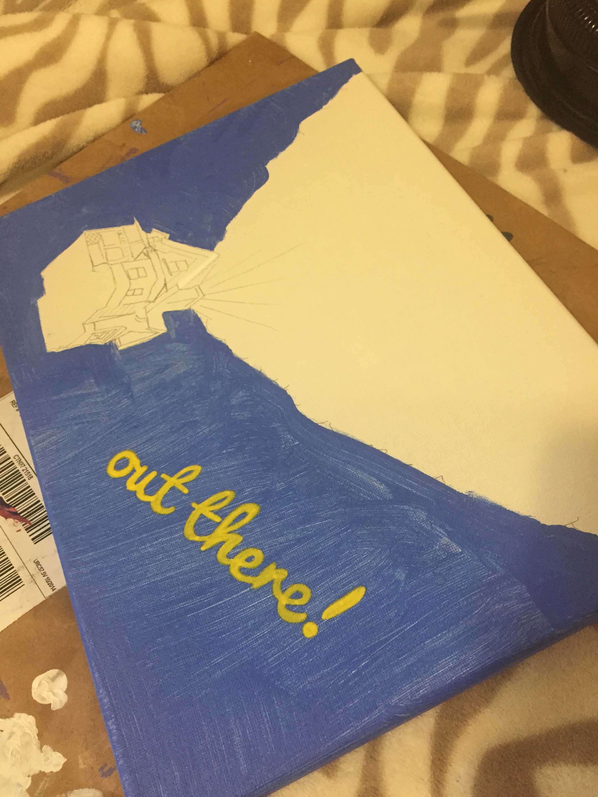
5. Think in Layers

Lay down a base coat first, don’t worry you’ll still be able o see the pencil through it. Work your way up in layers and be sure to keep tricky things like metallic paints away til the very end, as they’re incredibly hard to paint over with any light color.

6. Work Slowly

Just relax and listen to the radio or watch TV or even have your little quiz you on your econ material while you work. It’ll make everything easier. and more fun.

7. Let EVERY Layer Dry

Don’t get sucked into the fun only to break out the glitter before that last layer of paint was finished trying. The slightest bit of tackiness (even if it didn’t stick to your finger) will mean the glitter will be there forEVER. Think about it like your nails, you wouldn’t start the next layer of nail polish before the first was done drying right? Okay, well at least no self respecting manicurist would. It could lead to ugly bumps and dents in the paint that do NOT look cute. It’s also helpful to keep layers thing for the same reason, or else you’ll be sitting around with your hairdryer begging the white to dry so you can start adding words.

8. Look at the Big Picture

Always remember that a canvas across the room looks much better than one up close. While it’s nice to get everything right, that barely ever happens. Uneven borders can be fixed with outlines of gold or black, and organic shapes don’t have to be perfectly symmetrical, but once it’s up on the other side of the room, the canvas will look stunning regardless. So while it’s nice to play perfectionist, definitely don’t overthink it.

Boom Boom Canvas

For the BOOM BOOM canvas, I knew I wanted a heart to be the center of the piece. To keep the biggest ideas in focus, I decided to make the Pi Phi, Heart, and BOOM BOOM all evenly sized and spaced throughout the canvas, and fill in the areas with supporting words.

Pi Phi

After writing up the PDF, I printed a piece of paper with my poster theme on it, in black so it would be fairly visible. I taped the paper in the back of my canvas (it’s an 9×12) and traced the outlines.

IMG_6112

After tracing the outlines, I gave the canvas a quick wash in the purple I wanted to use for the background. This way I could still see the pencil through the paint, but I had a base of color down. Then I started tracing the letters in paint. After doing this with both a brush, sharpie, and paint pen, I recommend using a paint pen. It’s the most precise. For this project, I outlined the heart in red paint pen, but switched to red paint to build up a more opaque color (it took quite a few coats.)

IMG_0306

To make the BOOM BOOM stand out, I decided to do metallic chevron, with gold and silver paint pens. As I worked on this part, I noticed that outlining the letters in gold made the whole effect cleaner, even though you could see some of the white base poking through.

IMG_5436

The whole base coat still looked a little splotchy at this point, so I went back through and painted over it with a sponge brush and smaller detail brushes around the details. This gave the background a flat and clean look and really pulled the piece together.

IMG_5535